Focal Points and Focus
Focal points and focus can be used in many different ways. First of all focus could be when there is a halo around someone in a picture, something that makes you look at them or know that they are the most important part of the picture. Another way could be if you use the golden sector in a rectangle, finding a focal point in a piece of work, and finding the curve in the rectangle. My example being the Mona Lisa, showing that the face is a focal point, then the rest of the body finishing off the curve and the rectangle.

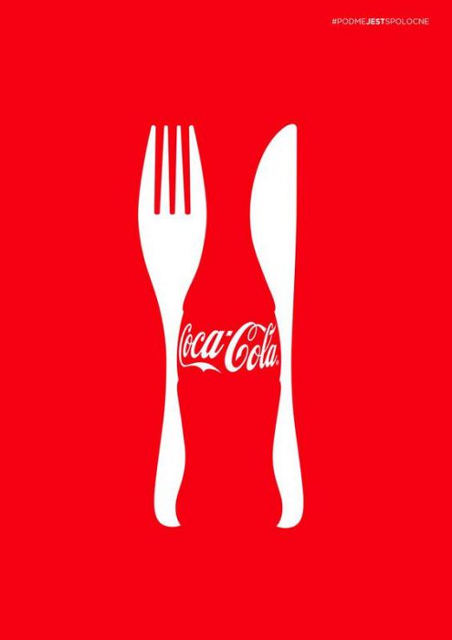
Negative space
Negative space is the space that surrounds an object in an image. This helps define the object and the positive space in the image to bring balance to the composition of the work. So if there is a solid block of colour, you can ‘cut out’ an image from that block of colour, which would bring a whole lot of focus to the image you create. It could also mean that there are two images within one image.
Leading Lines
Leading lines are lines within an image that lead the eye to another part in the image. They can be used for composition as if you want someone to look at something, you make blatant lines that are leading to the place you want someone to look at, so that they will follow the lines with their eyes to the image. Even if you didn’t want to focus, you could just use leading lines that lead into the distance as a good look to the art. Giving it a good feel. In posters information could even be on some of the lines, so the person would stop to read it when following the lines to the final object.

Alignment
Alignment is a type of composition that can give good rhythm to a piece of art. This is because it can look good if you align everything or some things in a photo or poster. It can even work with text if you line it up with a photo in any way. It gives art a good organised feel if you do it this way.

Contrast
Contrast is where you arrange opposite elements (Light and dark/smooth and rough/thick and thin) in a way that becomes attractive to the eye. This is used to create drama and excitement in a piece of art.

Balance
Balance in art refers to the way the elements( Lines, shapes, colours, textures) are arranged. This could include making the work symmetrical, so each side is arranged the same so it is appealing to the eye. It could also be asymmetrical, having each side different. But as long as they still work harmoniously it is still good balance. It could also be laid out in the way that one side weighs more than the other, either using heavier colours or bigger shapes.

Repeat
Repeat is simply when an element, shape, or colour is repeated in a piece of art. This is used as it works well on the eye and makes the artwork look great as it is simple on the eye and easy to understand. It does not need to be repeated in a line, it could even be repeated in random places around the page, or otherwise.

Scale
Scale is basically the size of an object compared to another. So say if you wanted someone to focus on one object first, you would make that bigger than the rest of the images on the page so it stands out. It could even be used in sculptures, making them unrealistically large so it stands out to the eye. So scale could either be it compared to other objects on the page or an object compared to how big it is in real life. I chose this example as the person on the left is larger than the other people.

Complimentary elements
Complimentary elements are elements(Shapes, colour, lines, texture, etc.) that go well with each other. They are therefore elements that ‘compliment’ each other and do not look bad with each other when next to each other. This could be as when colours on the colour wheel are opposite each other, they tend to go well with each other. And if two different textures you find look good together, then you combine them. They do need to compliment each other though, which means they need to look like they were made to be put next to each other, or one fills out another’s flaws. In my example I have used complimentary colours instead of elements as I could not find many good examples for another kind.

